Website Redesign
Lazy Susan's Granola
A full website redesign, from discovery through rebrand, cutting task completion times by 40+ seconds and achieving 100% pass rates.
Background
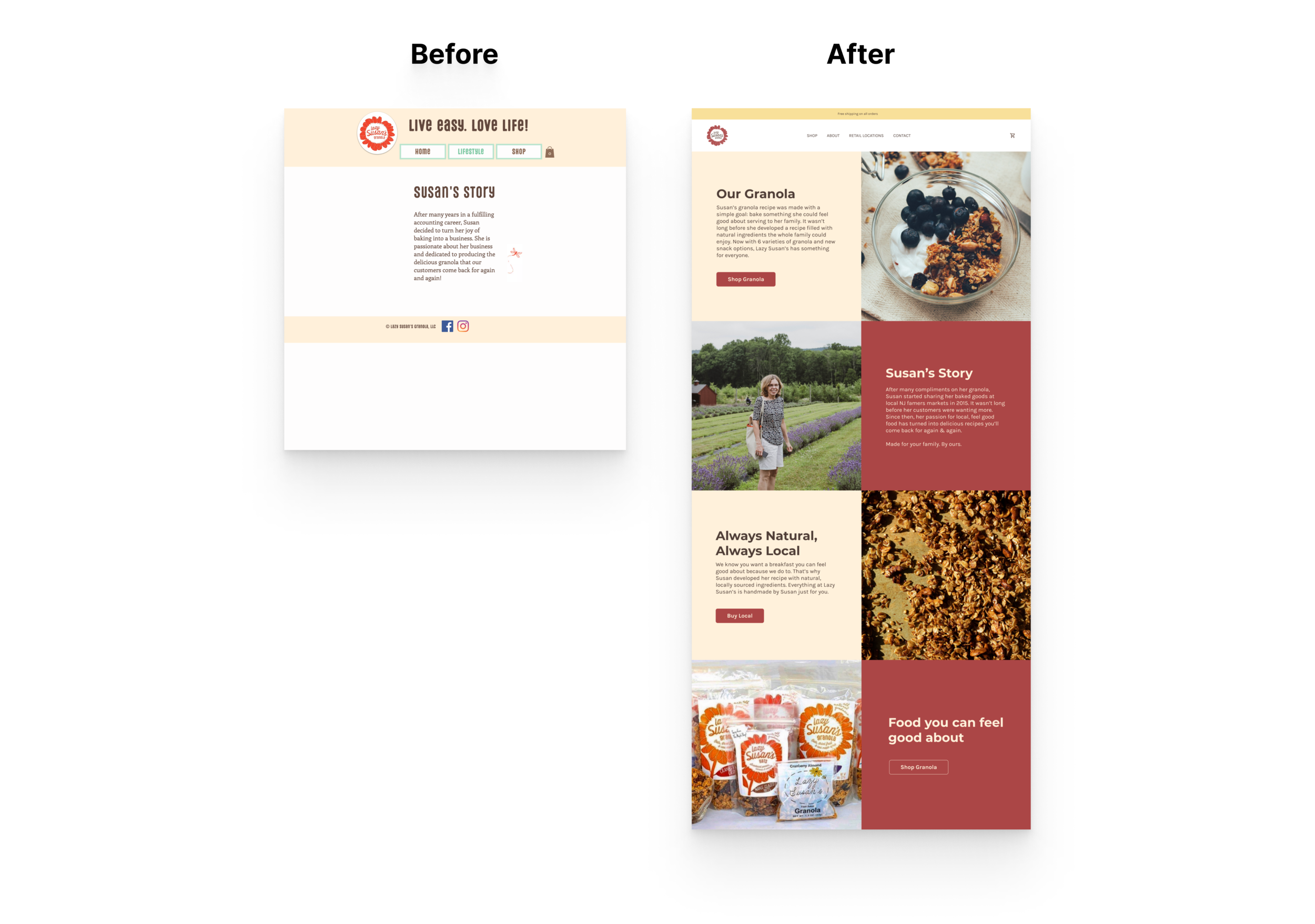
Lazy Susan's Granola is a family-oriented, all-natural granola brand utilizing locally sourced ingredients from northern New Jersey. I was responsible for all aspects of this website redesign, from discovery and ideation through visual polish and delivery, as they shifted from local brick-and-mortar sales toward a successful eCommerce business.
Problem
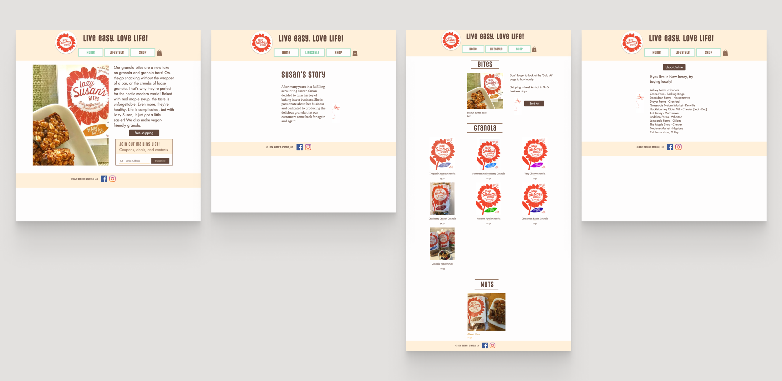
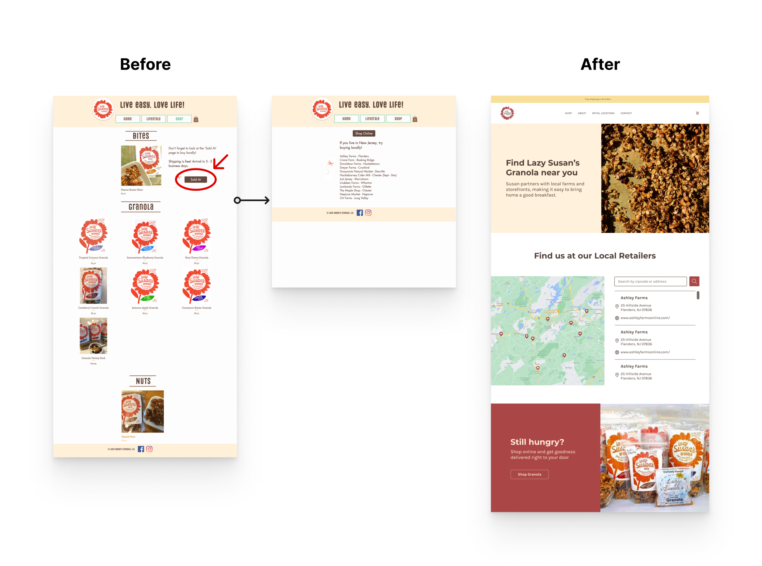
The site's navigation followed no coherent flow. Information was scattered across numerous pages, and the 'sold at' page was minimal and useless for non-local consumers. There was no traditional navbar or footer, and styling inconsistencies added a feeling of distrust.
Insights
Remote usability testing revealed significant pain points: users averaged 47 seconds to find brand information, with a 40% failure rate. 80% had difficulty with navigation, citing it as "confusing and misleading." Nearly all users noted styling inconsistencies that added confusion and a sense of distrust.
Solutions
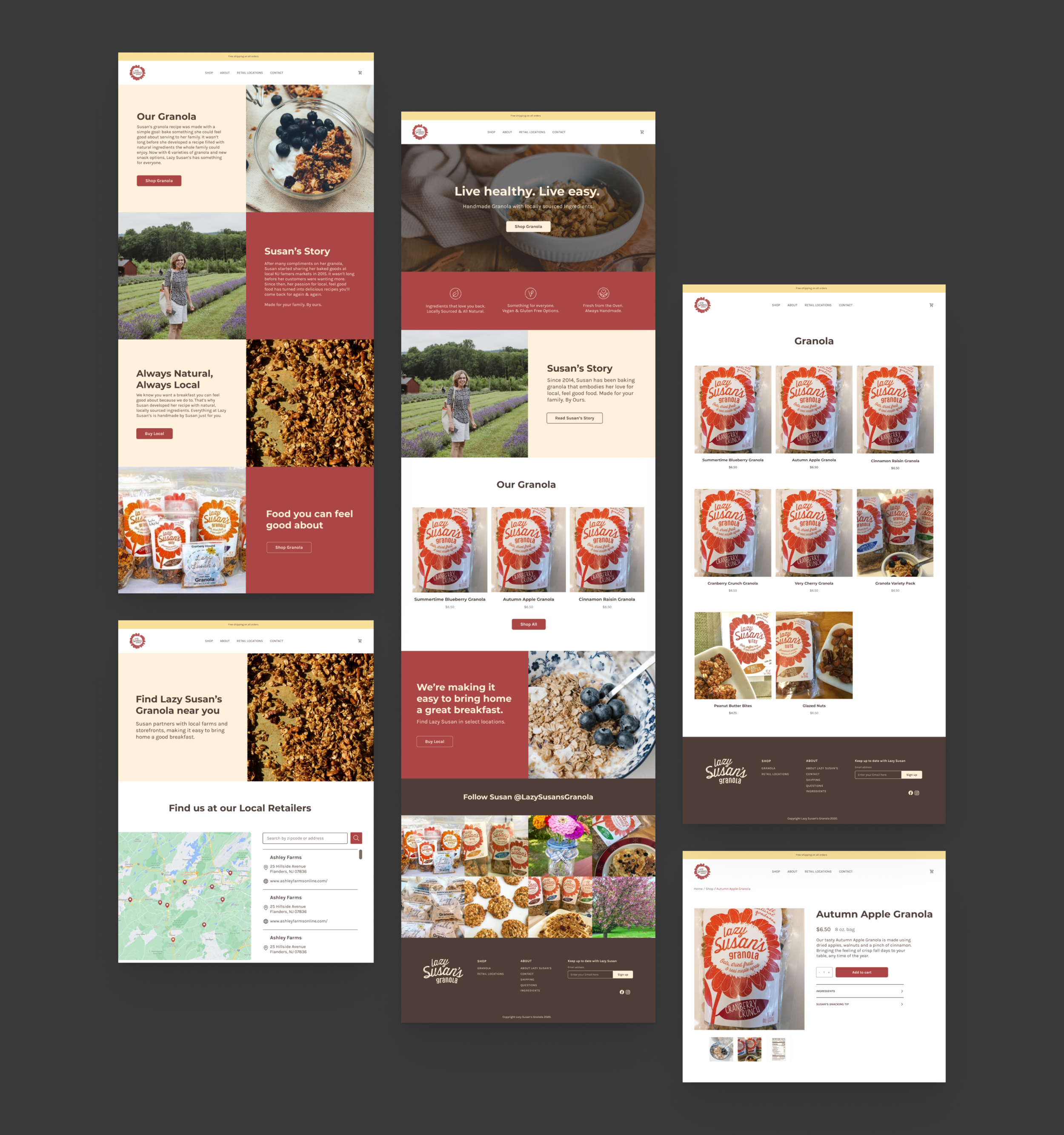
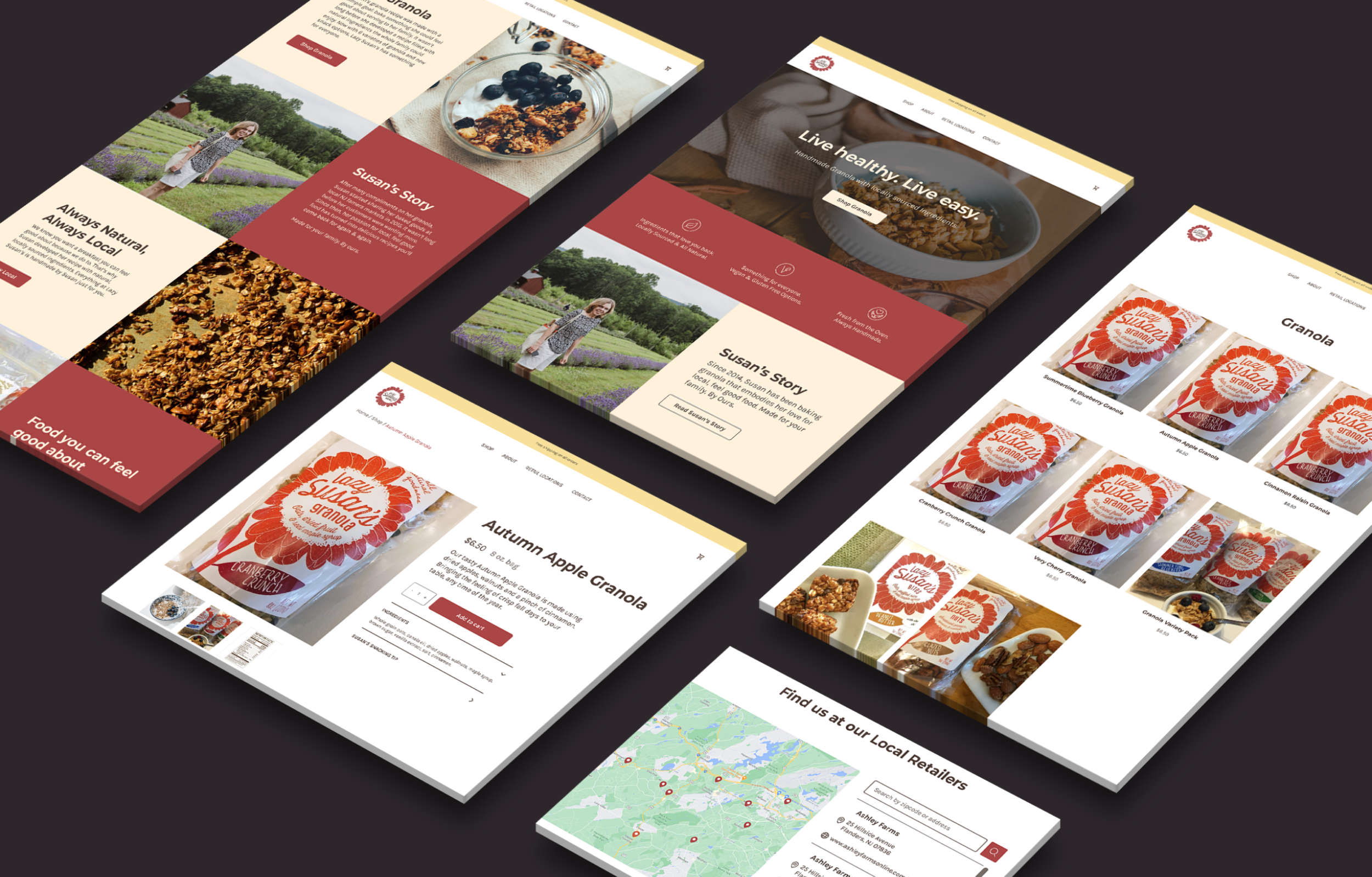
My priority focused on usability, redefining the information architecture to follow a familiar eCommerce experience. All pages became accessible via a traditional navbar and footer. I synthesized the flow so users can follow a linear path toward making a purchase.
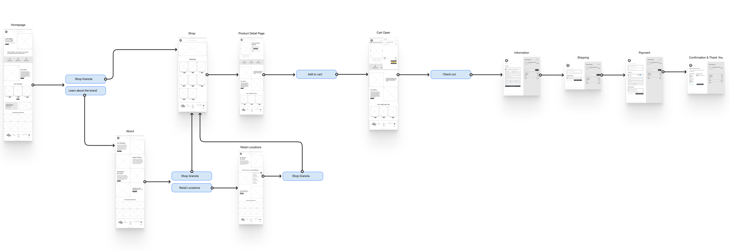
In simplifying both site and page structure, I combined areas of related information on one page, further eliminating unnecessary dead-end pages and reducing cognitive load.
Rebrand
The color palette, primarily red, brown, beige, and yellow, evokes the passion, stability, and warmth present in the brand's foundations.

Typography: Montserrat (headers) paired with Karla (body), modernizing the brand's personality while optimizing for readability.
Outcomes
In a second round of usability testing, all time-to-task averages were cut by 40+ seconds. Finding brand information dropped from 47 seconds to 5 seconds, with a 100% pass rate.