UI Kit & Branding Refresh
Higher Ground / Planetary Corp
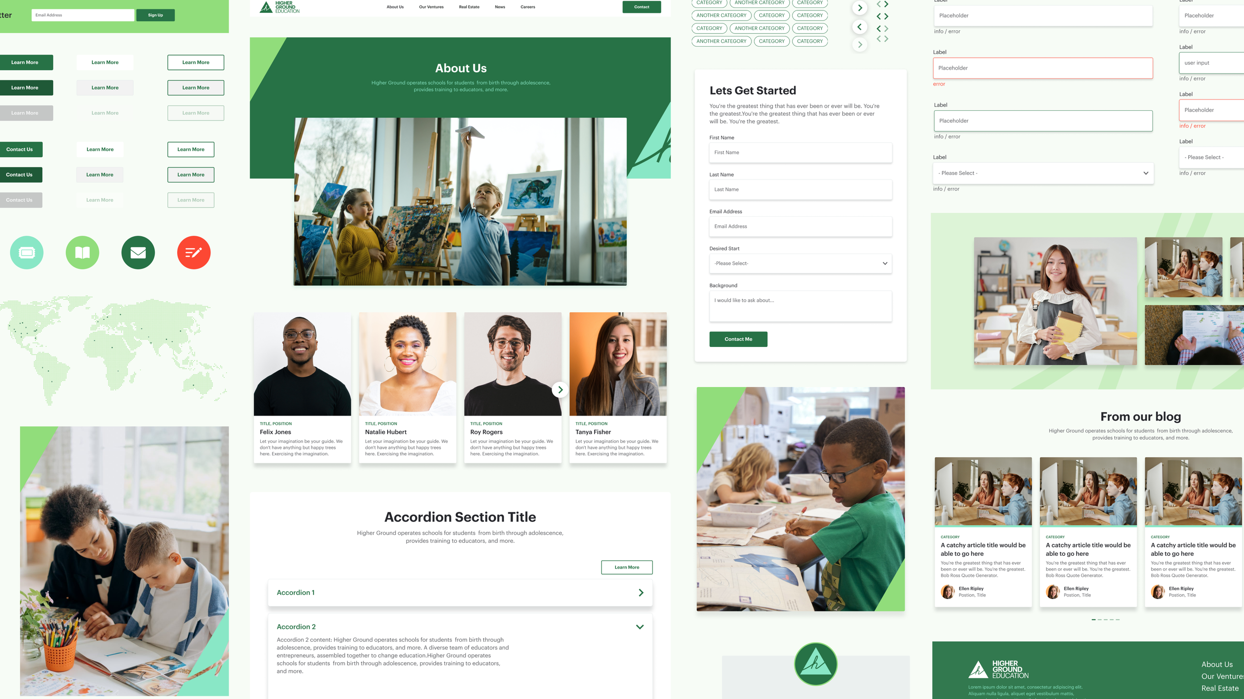
Developing a full UI kit and high-fidelity templates for Higher Ground Education's website refresh, completed in two weeks.
Context
Higher Ground Education is a tech-enabled network that seeks to modernize and mainstream the Montessori movement internationally. I was brought in by Planetary Corporation to complete a website redesign within a two-week timeframe, responsible for developing a new UI kit, including components and high-fidelity templates within their updated branding.
Concept & Direction
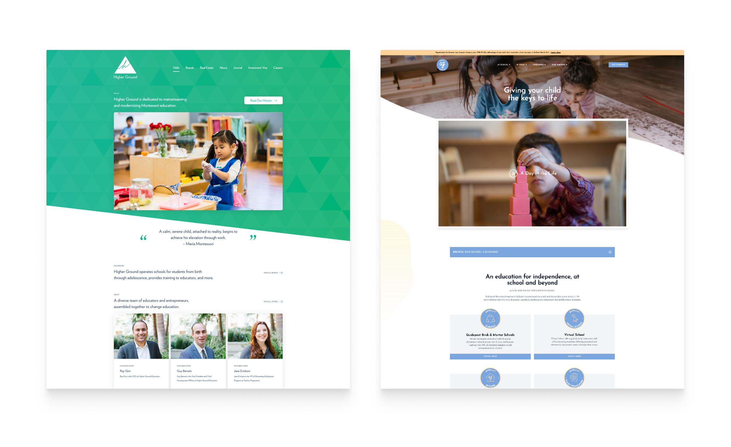
Higher Ground considered its subsidiary brand, Guidepost Montessori, the stepping stone for the new site's UI. Having the two sites be more visually consistent would further unify the brand while strengthening their overall mission and vision.
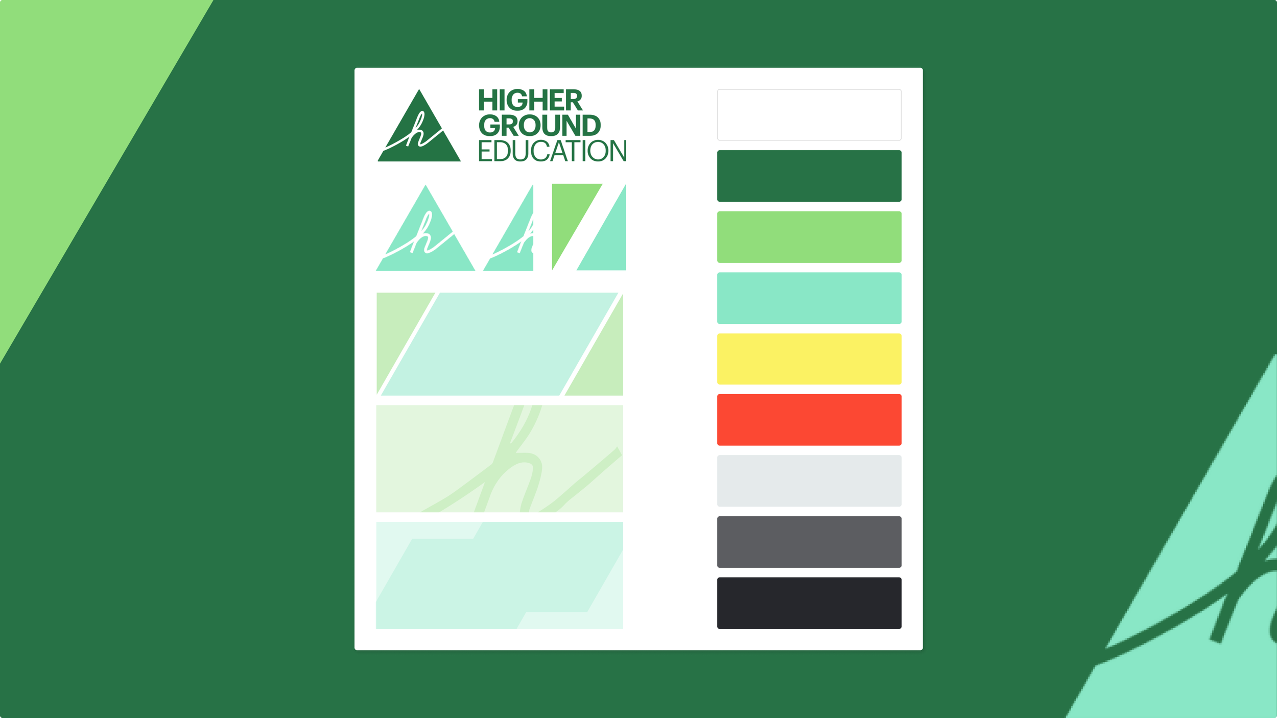
Higher Ground's updated Brand Guidelines helped orient the look and feel of the refresh. Their logo, an equilateral triangle of 60-degree angles, which informed most design elements. To the organization, the 60-degree angle visually represents the positive upward trajectory that defines Montessori values.
Process
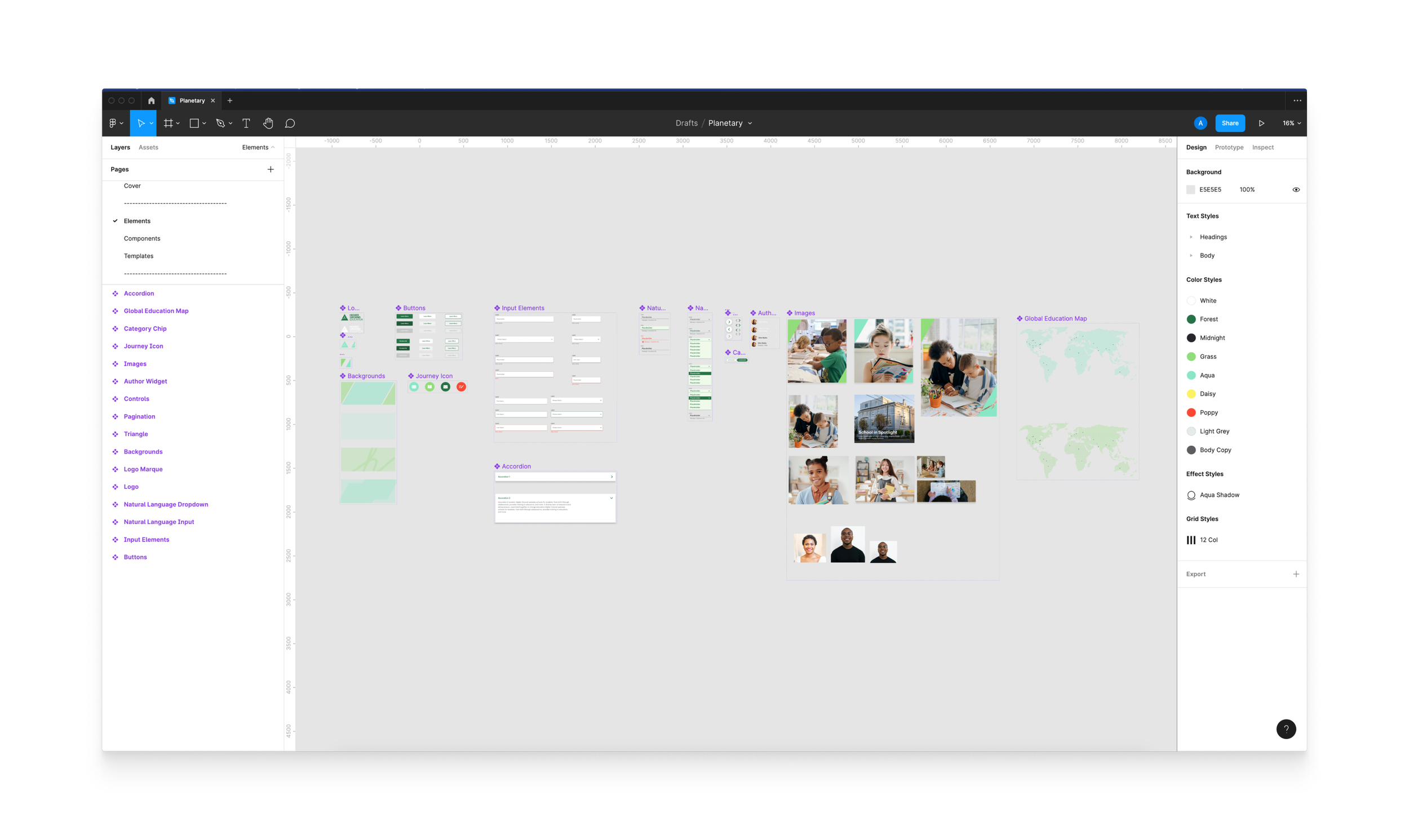
Before designing, Planetary conducted an audit of Higher Ground and Guidepost Montessori components. My design process was informed by atomic design principles, building from simple to complex.
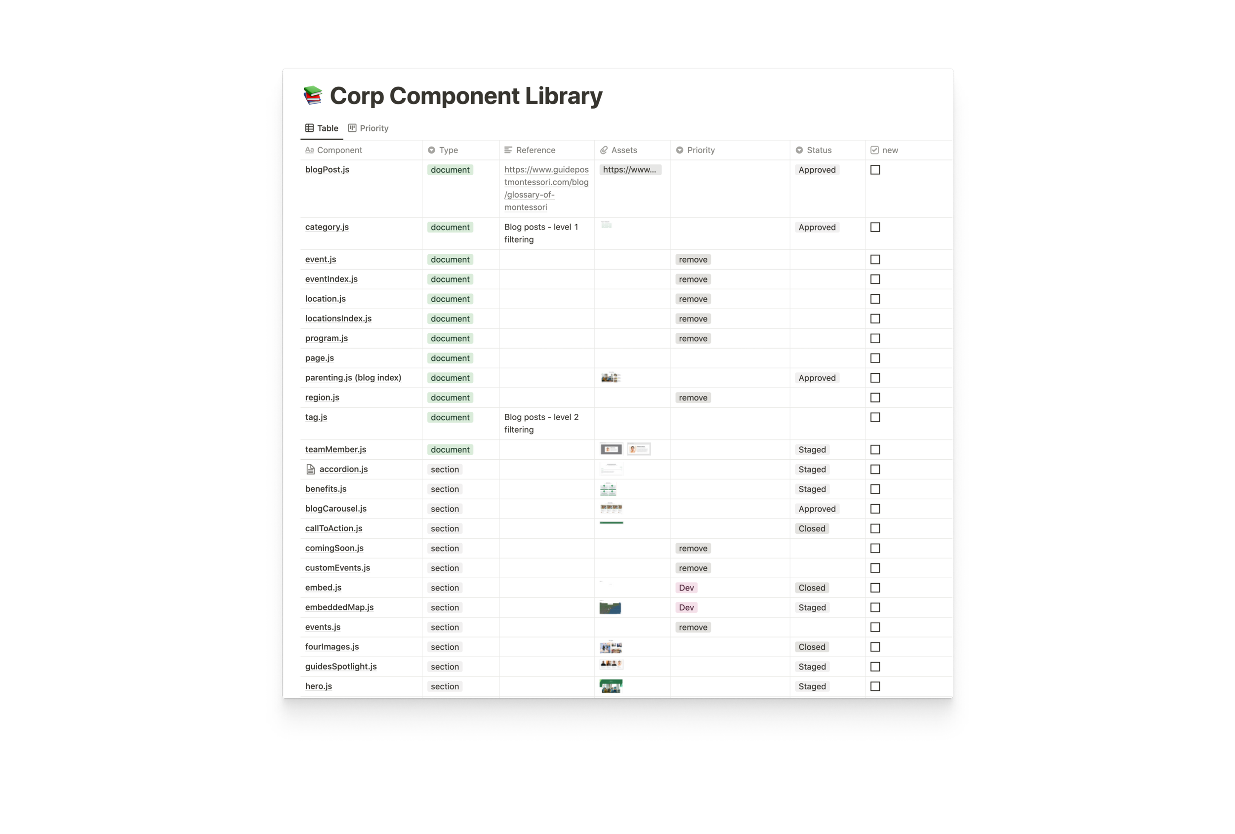
Reconstituting the components from foundational elements allowed me to inject more branding across templates while retaining consistency. My intention was to make it easy to mix and match components, reduce design debt, and make the developer handoff as smooth as possible.
Iteration
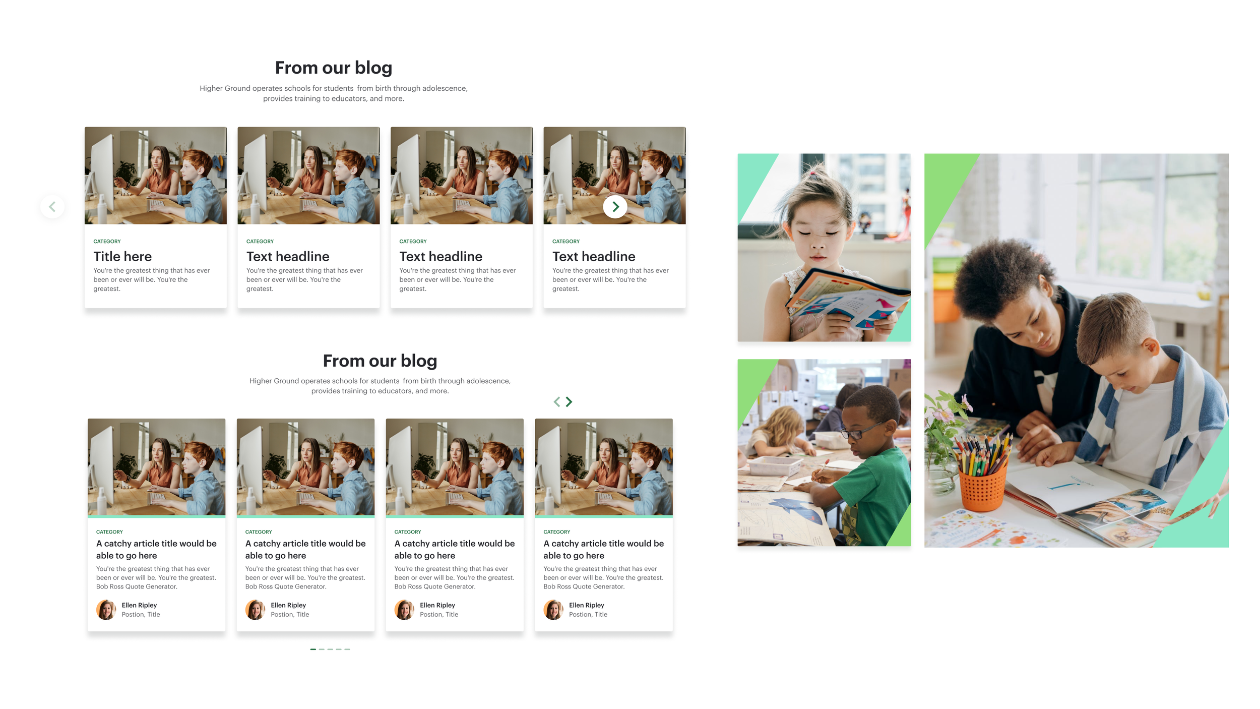
Iteration on components allowed for exploration to ensure contextual fit. I incorporated more brand assets and patterns where possible, utilizing the equilateral triangle logo in headers and image blocks.
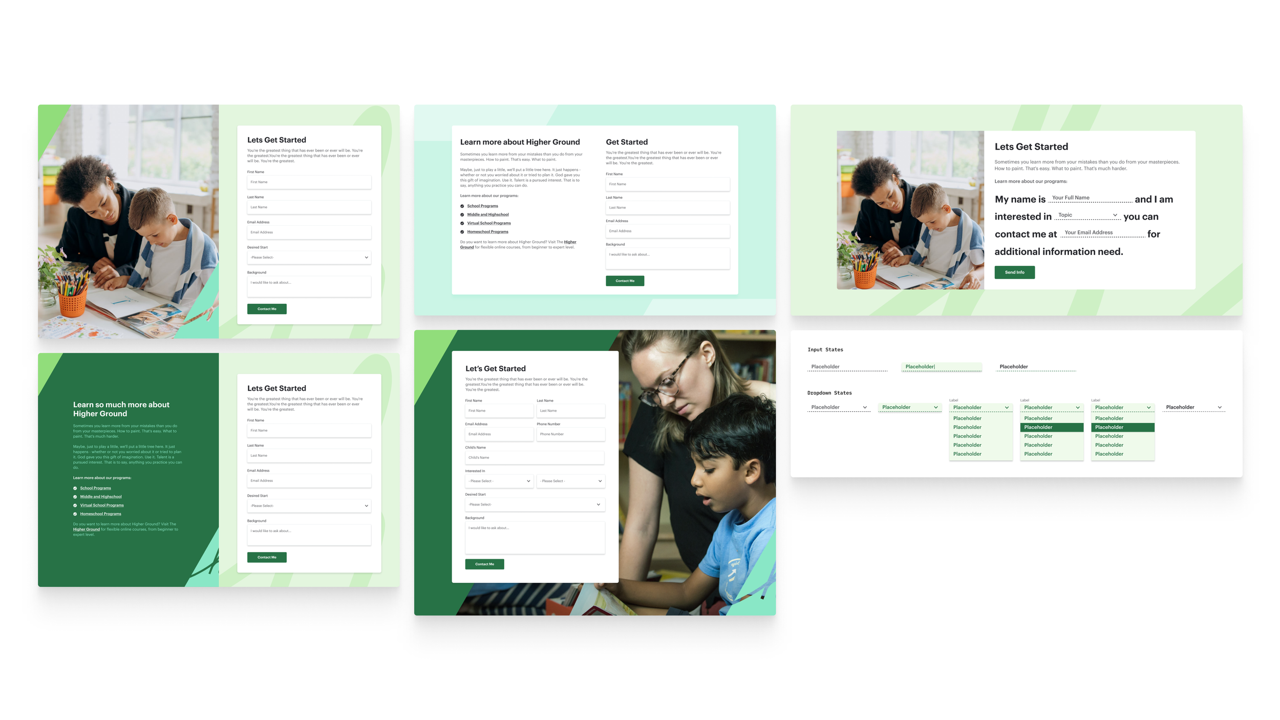
Lead generation forms required a variety of template designs. I experimented with a natural language form as one possibility, breaking further from the Guidepost design style.
Where it landed
All components and templates were approved by Higher Ground within one to two passes upon review, then handed off to Planetary's developers.
What I would do differently
Given the tight turnaround, the project was designed only for the desktop viewport. I would have spent more time developing multiple breakpoints and included proper documentation to bridge the gap between design and development more efficiently.